D3.js Force-Directed Network Chart
A JavaScript standalone implementation and Oracle APEX region type plugin My first Oracle APEX plugin and open source project :-) Everything started some months ago when I stumbled over this fascinating force-directed graph. I immediately had the idea to use this technology to visualize data models in APEX. My experience is, that direct after I documented a data model, this documentation is out of date. I wanted to have a live visualization of the data models. After the first implementation it turned out, that the resulting graph is also useful for other purposes and I decided to build up an APEX plugin for easier integration. If you use the bare JavaScript files you can run it on every HTML page: I found myself often fiddling around with the parameters of the physical simulation - change config, reload page, not amused, change config… Really annoying - even I know the implementation behind. So, the question was: What can I do for an easy configuration. My answer was after a while of thinking and trying out: A customization wizard with a live preview of the changes. The link to enter the wizard is shown when the debug mode is switched on or in APEX when the developer bar is shown - try it out on the getting started page of the API docs. You can find the sources and more informations on GitHub and a demo app on apex.oracle.com. Happy networking :-) Ottmar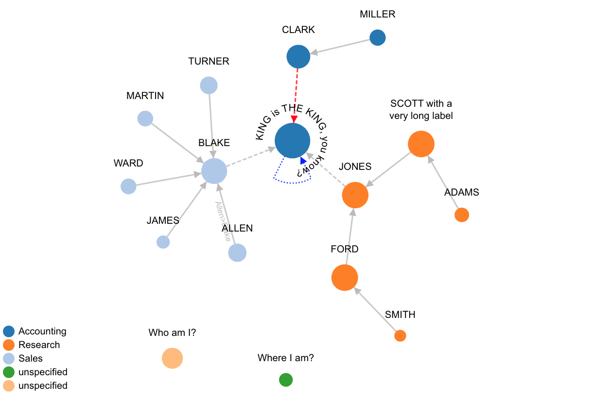
<div id="example"></div><!--the graph container-->
<link  href="/d3.js/d3-force-3.0.0.css" rel="stylesheet" type="text/css">
<script src="/d3.js/ResizeObserver-1.5.0.min.js"></script>
<script src="/d3.js/d3-3.5.6.min.js"></script>
<script src="/d3.js/d3-force-3.0.0.min.js"></script>
<script>
window.onload = function() {
  window.example = netGobrechtsD3Force('example')
    .height(400)
    .width(800)
    .useDomParentWidth(true) //for responsive layout
    //.zoomMode(true)
    .lassoMode(true)
    .wrapLabels(true)
    .showBorder(false)
    .debug(true) //to enable the customization wizard
    .render(); //sample data is provided when called without data
    //also see https://ogobrecht.github.io/d3-force-apex-plugin/tutorial-1-getting-started.html
}
</script>